
This October the DMA’s asked me to go to Vegas and talk to direct marketers about infographics. I’m expecting them to teach me as much as anything I have to show them, but – in the hopes of delighting at least one of these ninjas – I’m doing a deep dive into infographics:
- What makes them work?
- How do the best churn out winners time and again?
- What are some reasonable design principles?
- Can I make an infographic presentation into an infographic about infographics?
I’ll hopefully share the odd tidbit from these preparations in the coming months. This first tidbit comes from a pretty basic observation:
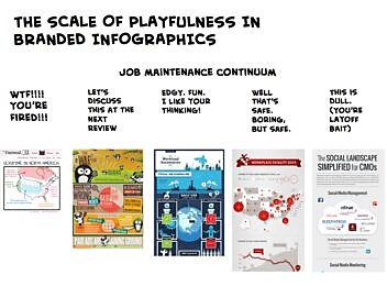
When you start to produce infographics, you’ll want to get an idea of how edgy you can be. How much personality can you show in your design?
In the interest of sparking halfway intelligent discussions about this, I produced a simple presentation that takes five infographics ranging from the very edgy to the very dry. And for enlightenment, I also plotted those points on a job security continuum. Enjoy.
If you can’t see the embedded Scribd document, go here to see it directly in Scribd: http://www.scribd.com/doc/103803603/Scale-of-Playfulness-in-Branded-Infographics
(Hit the full screen button in the bottom right in order to see it properly.)
Enjoyed this article?
Take part in the discussion


Comments
There are no comments yet for this post. Why not be the first?