
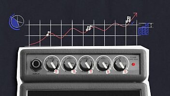
We love infographics here at Velocity and are big fans of Edward Tufte and Information is Beautiful and Data Flow and stuff like that. But we just had to share this one: an infographic with audio called Fractions of a Second: An Olympic Musical.
It’s by Amanda Cox and The New York Times and it’s an absolutely brilliant way to demonstrate something that can’t really be communicated in a purely visual display: the difference between the winning time in a range of Olympic winter sports and the other finishing times.
Anybody else ever see an infographic with sound that was so well suited to its brief?
Enjoyed this article?
Take part in the discussion


Comments
There are no comments yet for this post. Why not be the first?